(designer)
CROSSTIE
(publication, typeface)
- → Download CROSSTIE
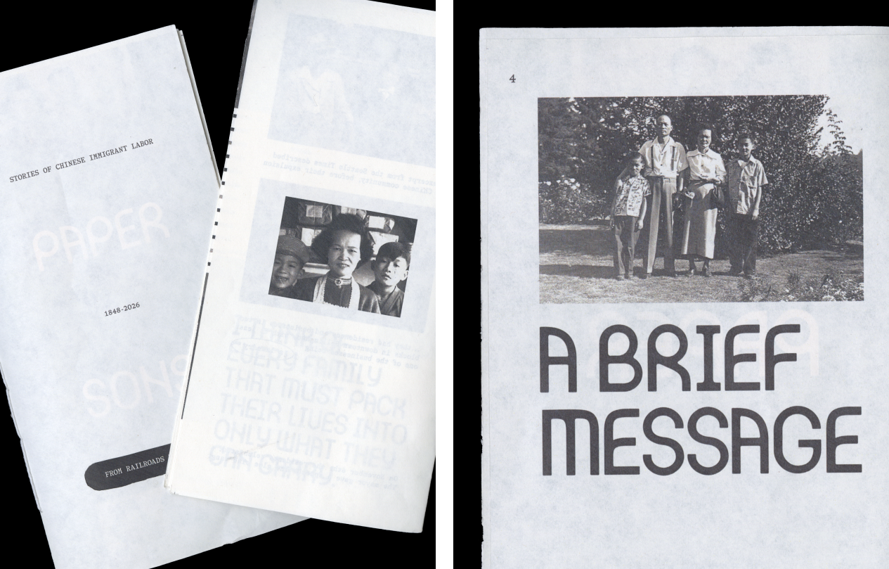
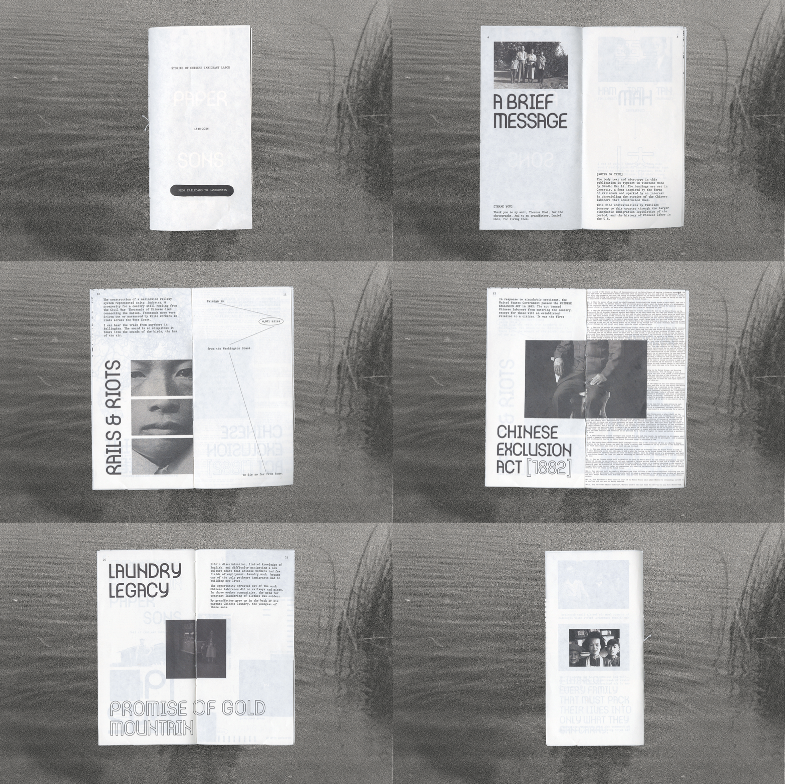
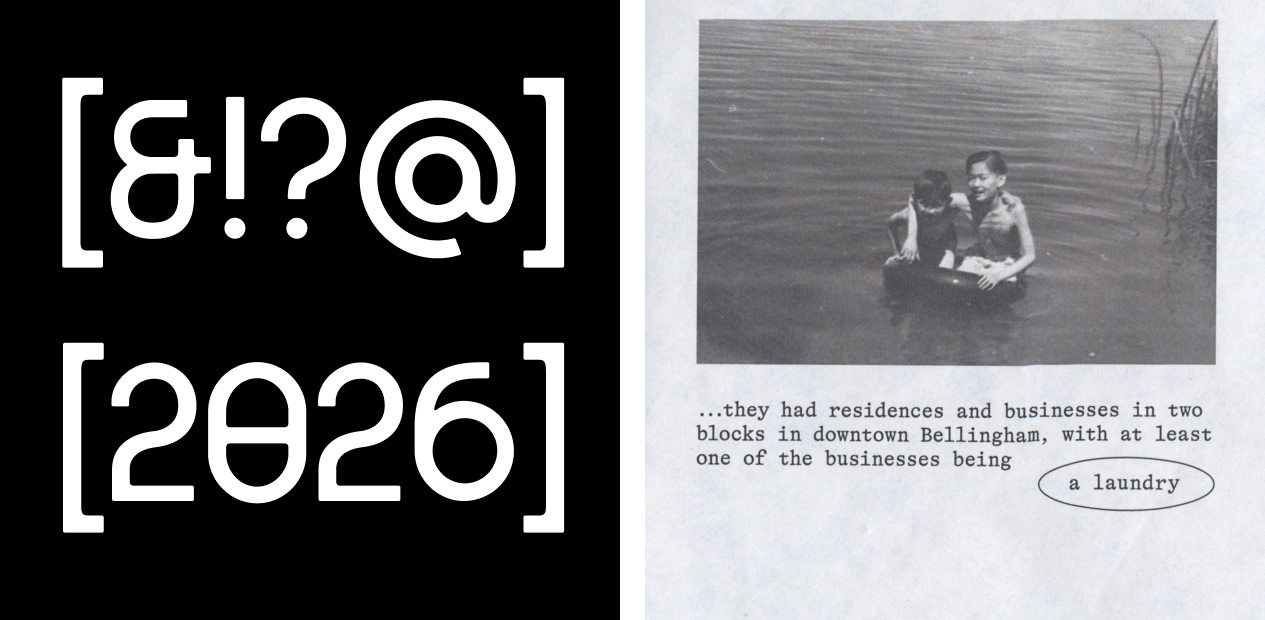
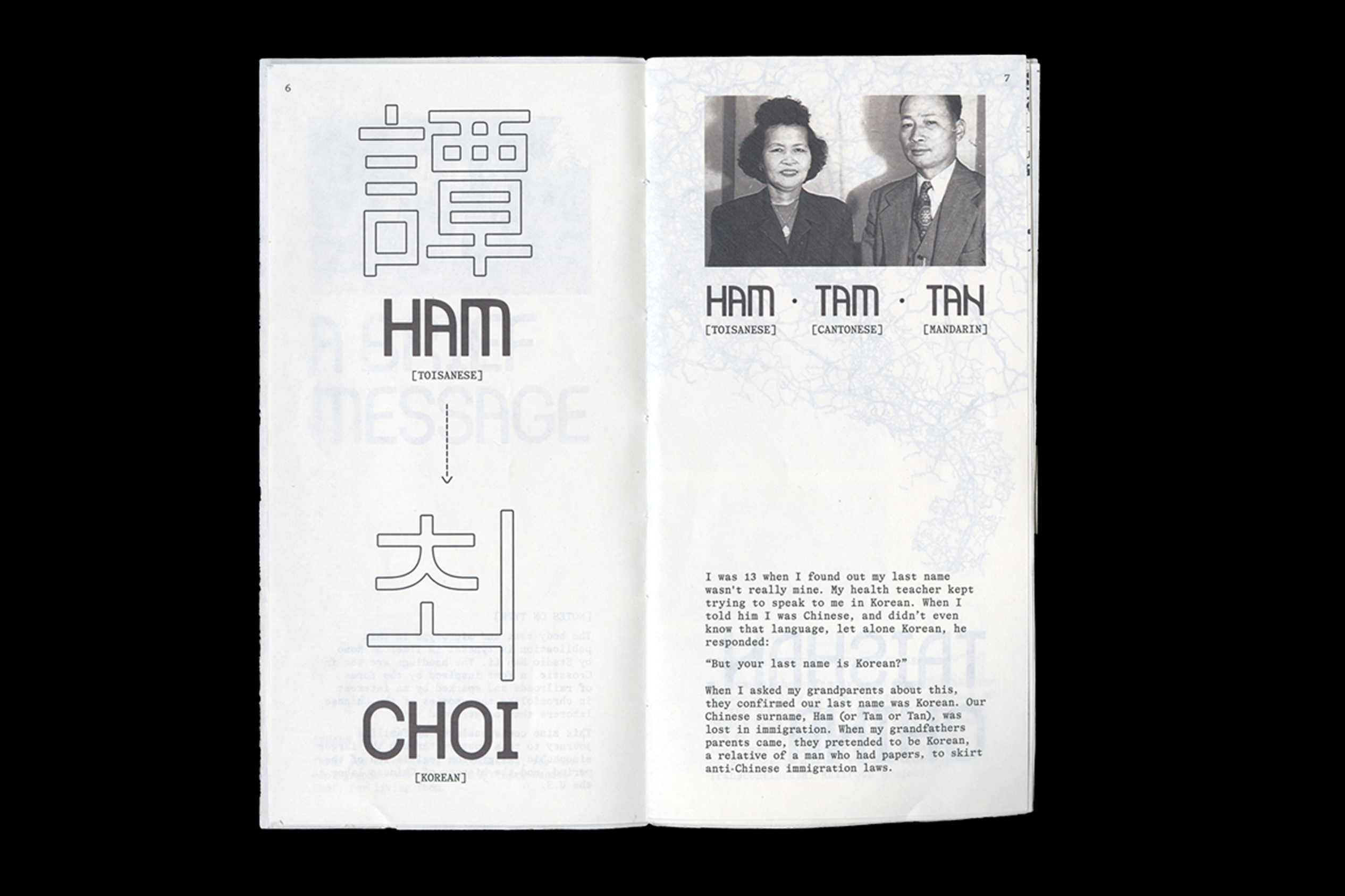
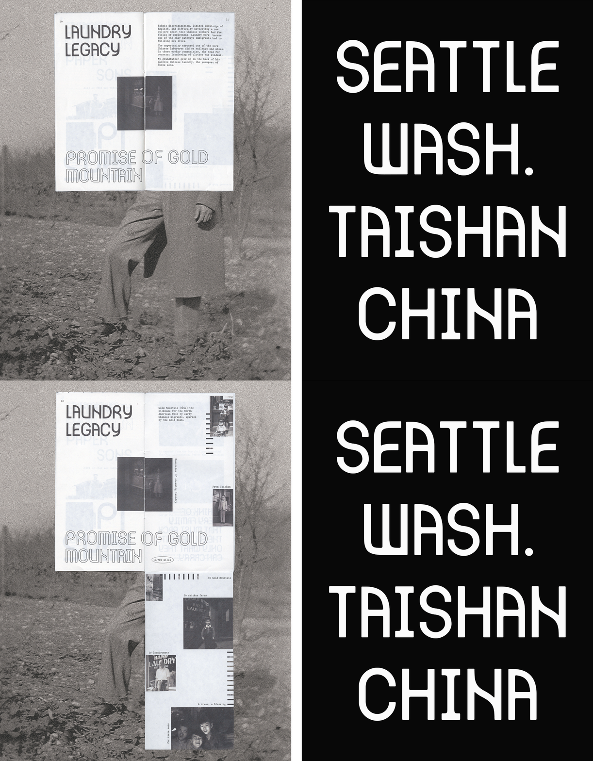
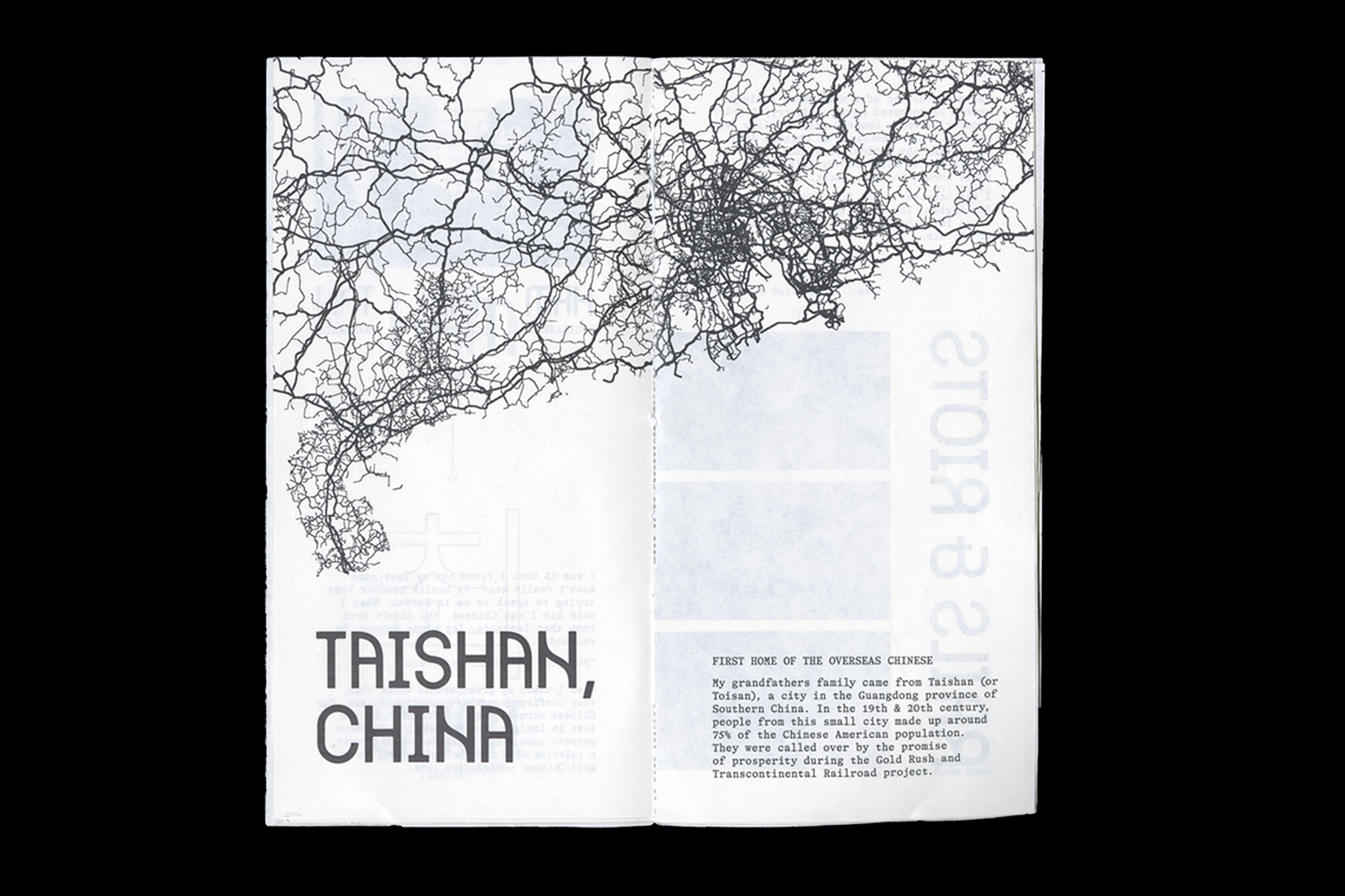
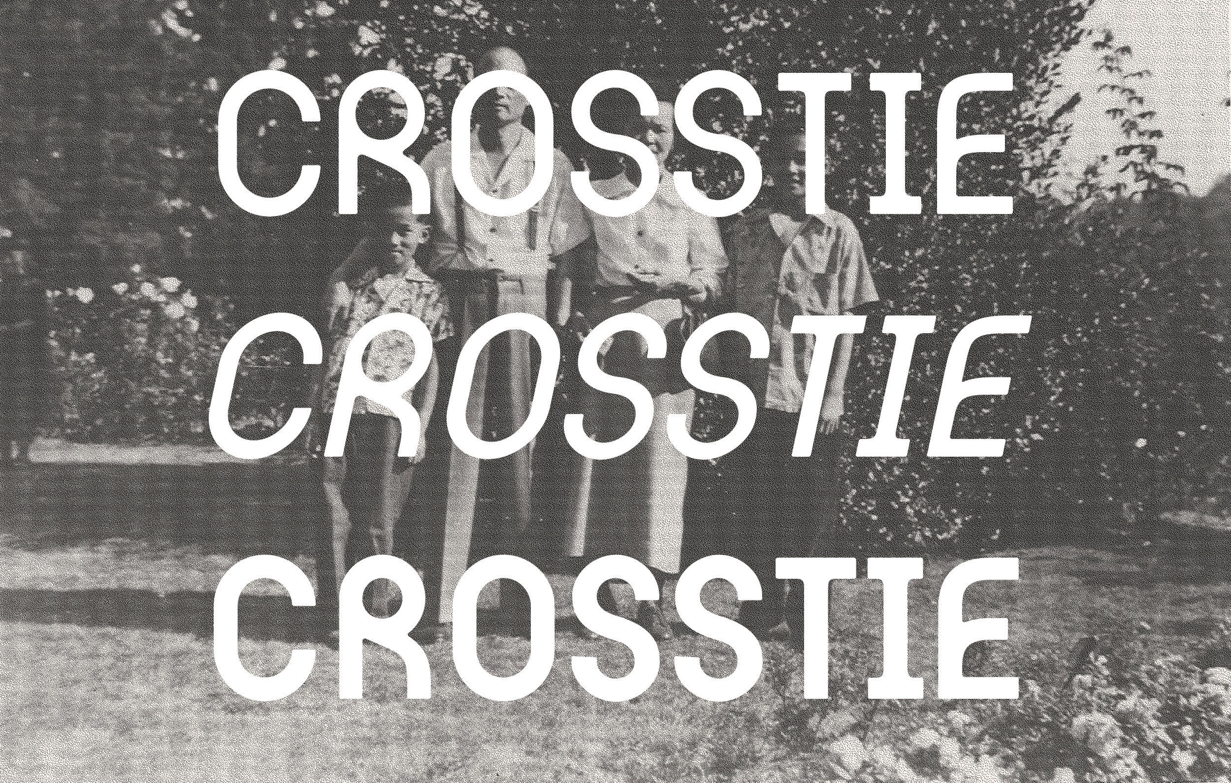
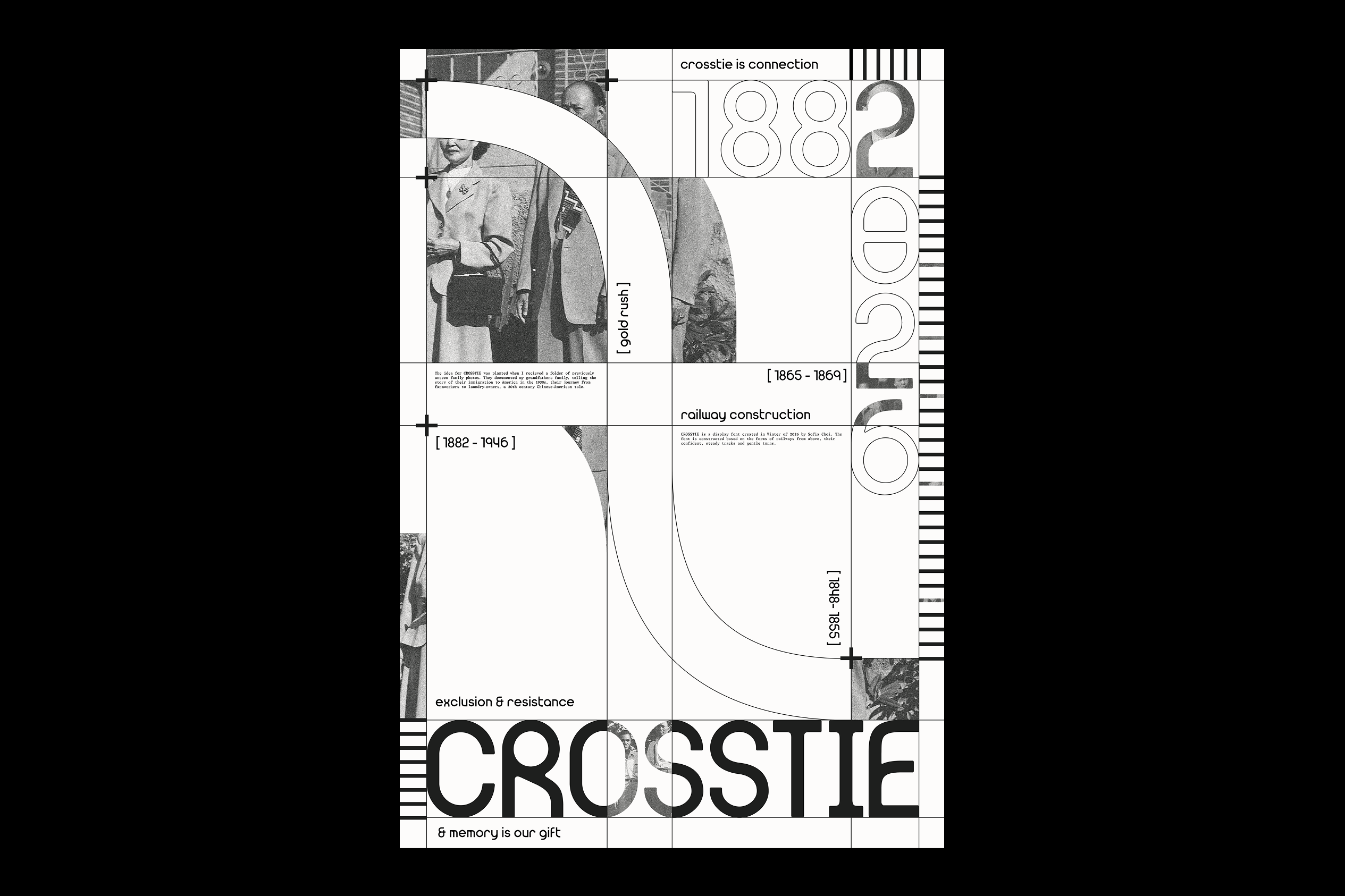
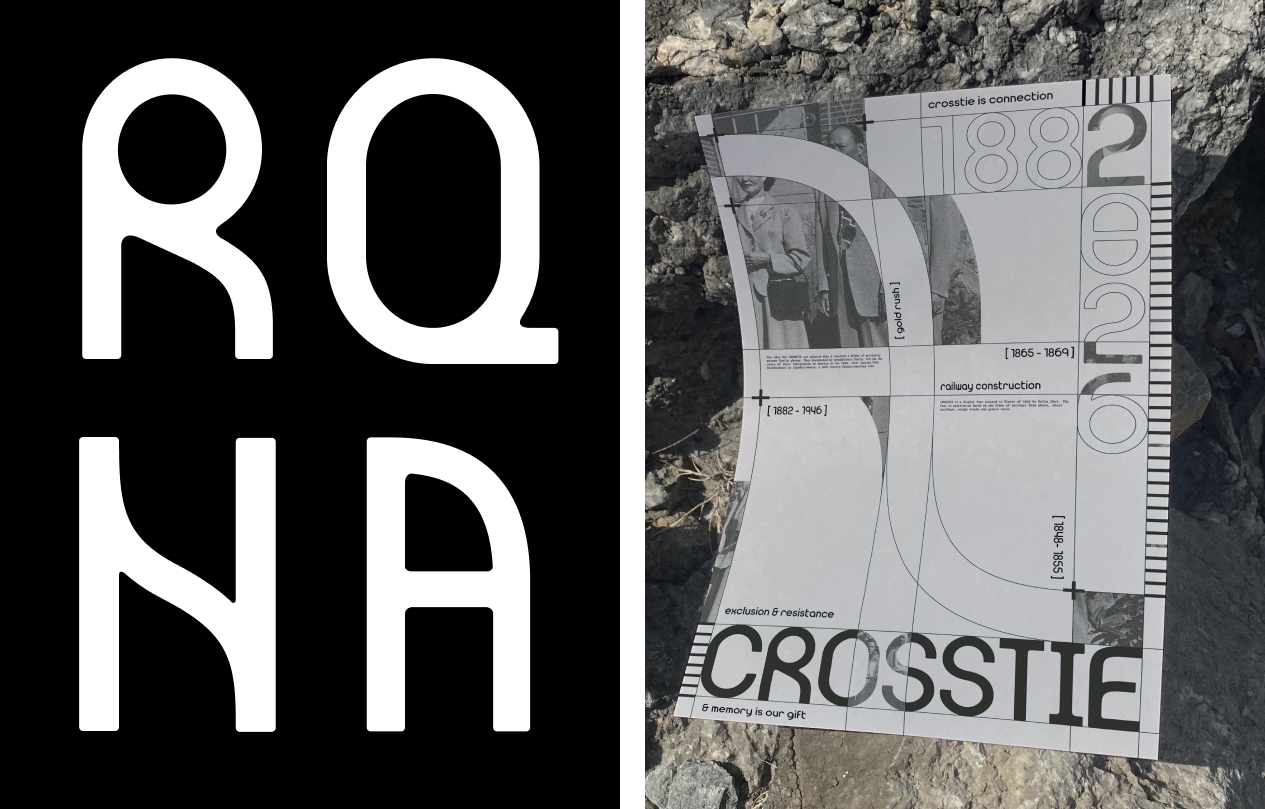
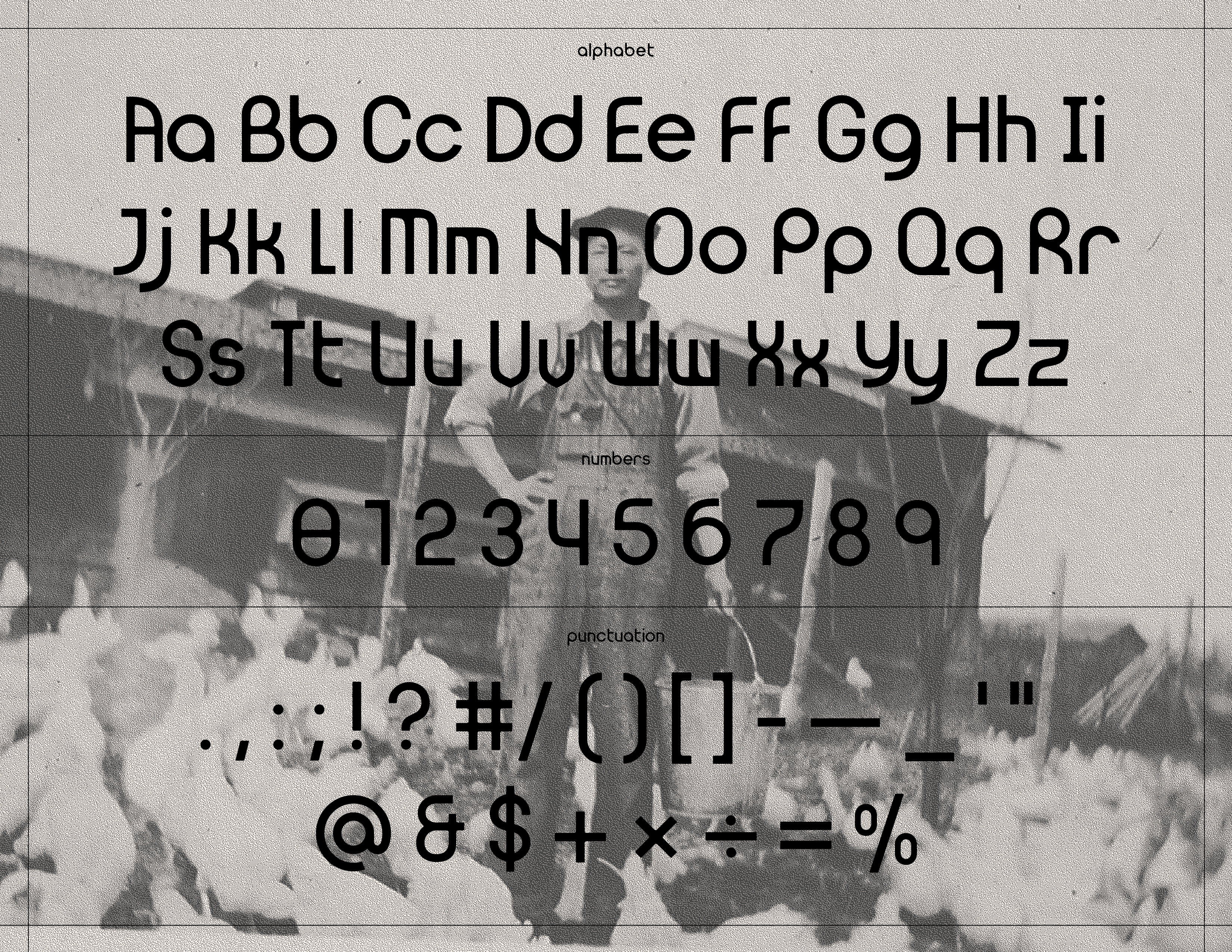
CROSSTIE is a display typeface that draws from the forms of railroads, and speaks to immigrant laborers who built them. Conceptualized in Western Washington, where the train can be heard in all directions, it confronts the history violent of expulsion faced by Chinese communities across the West Coat. It's modern construction commentates on resilience and memory, exploring how a legislation like the Chinese Exclusion Act echoes in anti-immigration politics today. The typeface is demonstrated through a publication, Paper Sons, wherein photos sourced from a family archive track the history of Chinese immigration through the story of one family. The typeface was created in Glyphs Mini, it features a full upper & lowercase character set, numbers, and built out punctuation.
Type in Use
The type-specimen's for this typeface include a publication and poster. Based on my own family's history as Chinese immigrants, and an exploration of the labor they engaged in, it pulls from an archive of family photos dating from roughly the early to mid 1900s.